You know that old adage: “Be Careful What You Wish For”?
Well, I’ve been wishing for a new blog design for quite a while and finally took the plunge a few months ago, working behind the scenes thinking about the functionality I wanted, deciding on a new theme, hiring an illustrator, looking at colors, etc.
I continue to devote quality time to upgrading my blog design. My blog looks a lot better than it did several days ago, but it’s still not where I want it to be.
But, I’m working on it.
Honestly, technical stuff like coding is not my area of expertise and things never work as planned. For those reasons it’s taking forever. It’s frustrating, yes . . . . but I do like the improvements I’ve made so far. Don’t worry! — if you don’t like the font or font styling, please know that I don’t either and that’s something I intend to change.
Oh, and speaking of positive change, if you would like to see something on my new, improved blog, don’t be shy. Comment below or email me and let me know!
Anyway . . . I just wanted to let you know that I’m trying my best to get things done as quickly as possible. There are good reasons why I’m doing all this . . . which I will explain in a blog post very soon. Included in that blog post will be an introduction to the wonderful artist who drew the illustration at the top of every page.
I LOVE how it turned out. Don’t you?
Happy weekend, you guys. Enjoy the cool Fall weather! I know I will.

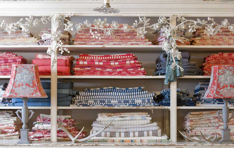 I could spend a small fortune on these vintage ticking fabrics!
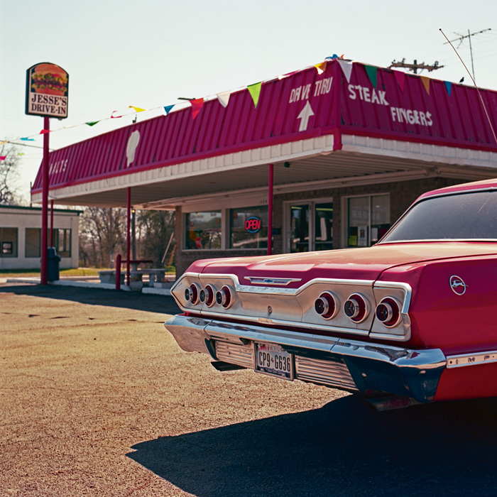 a wonderful image of an old fast-food joint in Mineral Wells, TX that brings back memories of high school
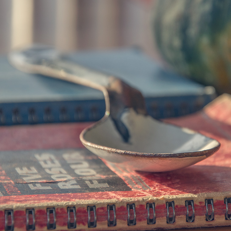 an absolutely superb still life image that brings to mind memories of family get-togethers
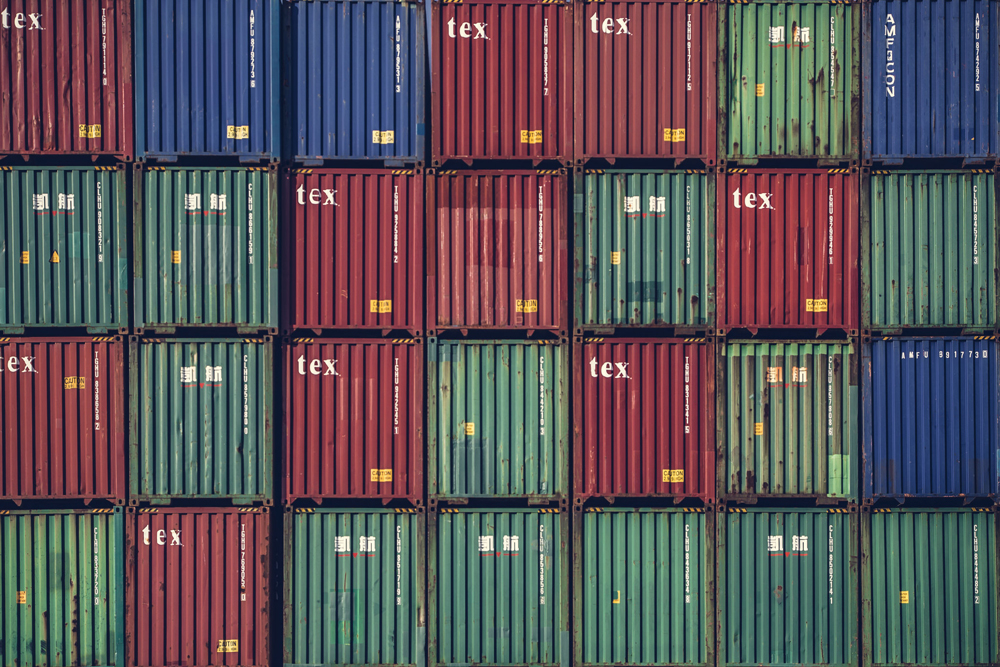 Who knew that shipping containers could be so pretty?
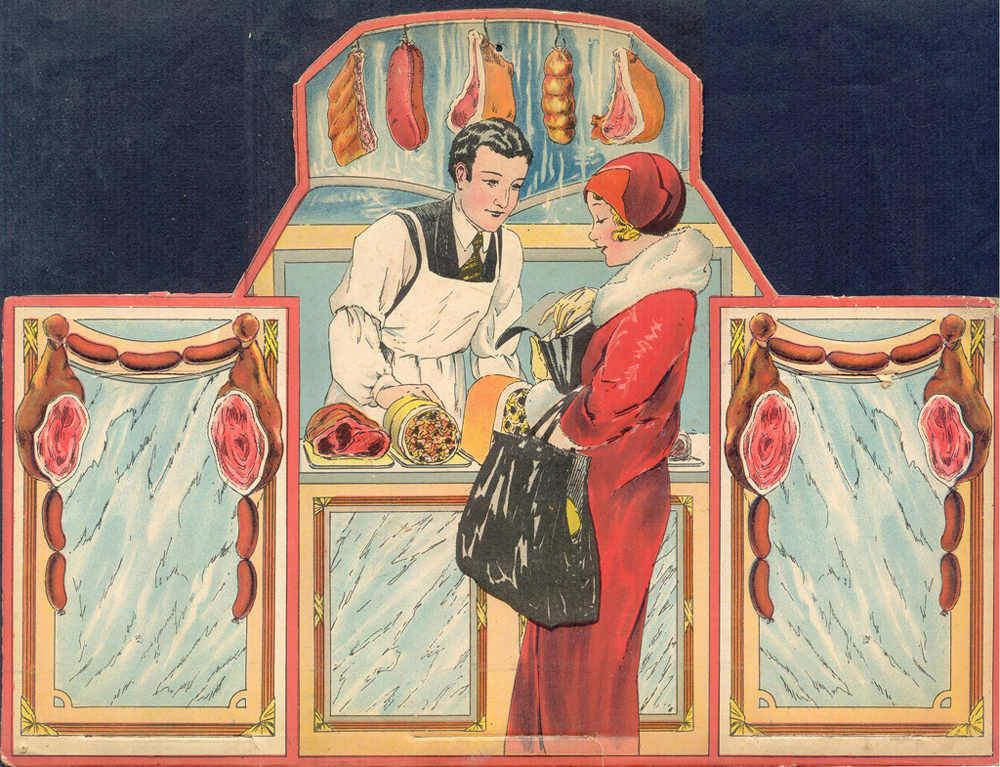 a really fun vintage illustration of a lady shopping at a butcher shop
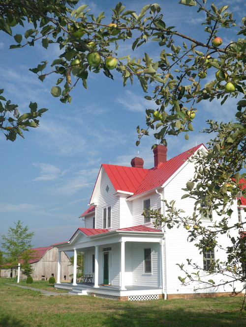 an incredibly well-done renovation of an old farmhouse
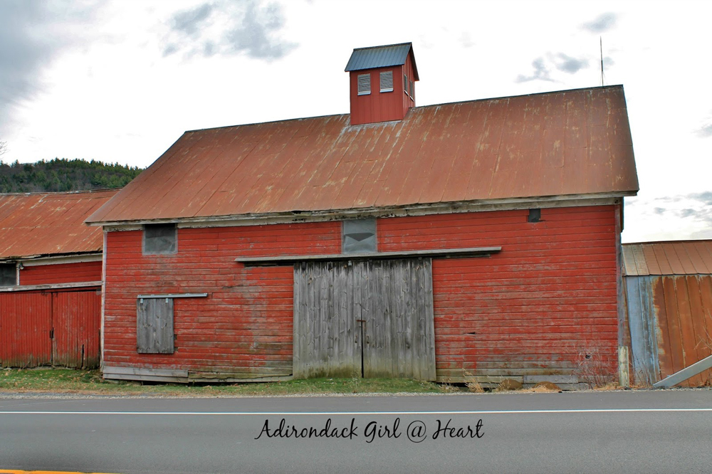 a wonderful red barn
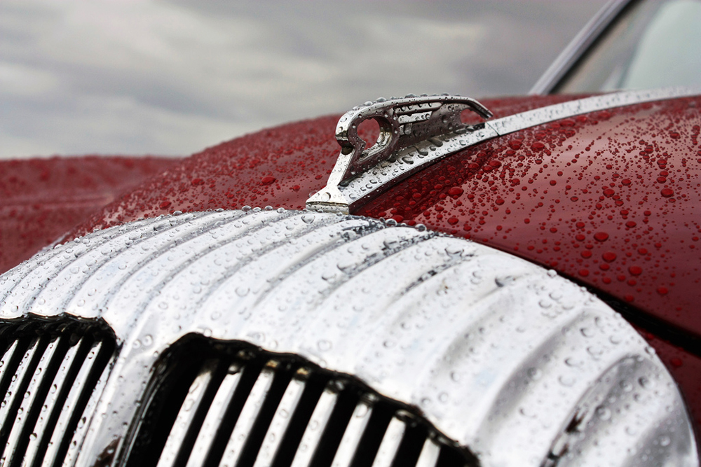 such a pretty, rainy day photo of a well-kept ride
Sources and Image Credits:
(All images are used with permission from the owners.)
One: Red Ticking
Two: Phil Bebbington via Flickr
Three: Keeping with the Times
Four: Matt Wiebe via Flickr
Five: patricia m via Flickr
Six: Outlaw Design via Houzz
Seven: Adirondack Girl at Heart
Eight: Richard via Flickr
(You can also right click on each image to view the sources.)
Hi Kim, your blog is lovely. Bravo to you for writing your own code – wow – amazing. Thank you for featuring my spoon image today!
Thanks so much, Barb . . . and you’re welcome! Also, I wouldn’t say I’m writing code exactly, but I am trying to insert code into the appropriate places.
Thank you for the wonderful pictures!! Wonderful!! Great to look at! Love the farmhouse!
Thanks so much, Cindy!
Kim,
Your blog is beautiful!! You are so talented. I am attempting to start a blog. I only wish I had your talent!
Wonderful posts and congratulations on your success!!
Angie
Angie, thanks so much! Please call or email if I can help you with your blog. I’m planning to write a blog post about the tools that I use with my blog, so maybe that will prove helpful for you. 🙂
The new blog format looks so crisp…colors more vivid! I do have one suggestion? The text color is a bit hard to read on a white background…a darker color would make it easier on the eyes…especially aging eyes :–) It’s also really hard to see on a small cell phone screen. Keep up the good work! I love your blog. Congratulations on a well-deserved publishing event! Say “hi” to the puppies…especially the little Jack Russel who is always curious about what you’re doing and peeking around the corners in some of your photos 😉
Thanks so much for the feedback, Cindy! I don’t care for the font or font styling at all either, and I certainly intend to change that. (Next week, I hope.) I’ll hug Kacy for you. It’s just about time to take our daily walk to the mailbox.
Wow! I think everything looks great! I wish you lived closer to me so you could work with me on my house! Love the blog. Nice job!
Thanks so much, Sally!
Enjoyed your blog today, but I always enjoy it, the pictures you have they make my day. Are you not doing any demolition, because I always enjoyed how quickly to guys worked and the interesting things you would find.
I always love hearing from you, Heather. You’re one of my biggest fans. We’re still in a holding pattern when it comes to salvage projects, due to a major reason I’ll be sharing on the blog soon. We hope to salvage at least a few more old homes before we call it quits. It’s such hard work, and we’re not getting any younger!
I love the illustration at the top, it’s darling and love the colors. I sat and looked at it for a long time.
Are you talking about the butcher shop illustration this week or the factory illustration last week? As you can tell, I’m a huge, HUGE fan of all art, including illustrations; thus, the reason for my new blog header. 🙂
Oh, big duh! You must have complimented me on my new header! Just call me dense. So happy you love it! I’m so very proud of it.
I am usually more focused on your great content than the nuts and bolts of the blog as I don’t blog, am just a reader. I did notice your new header illustration though – is it your home or another place you know? I agree with Cindy that a darker font would be easier to read. I have noticed lately on a few blogs that some of the pictures are bigger than my laptop screen so cannot see an entire picture on one screen but need to scroll down to see a bit more of a picture. Not always and not just your blog so not sure if it is my computer? The pics that don’t fit my screen today are the spoon and the drive-in the others are fine. Not sure if they were just posted at dif sizes or like I said could just be my computer. Red is one of my fav colors so am enjoying todays post – thanks!
Larger images are one of the reasons I converted to another blog design. I didn’t realize that some people may have difficulty viewing them on a laptop screen. Hmmmm. Something to contemplate. Thanks so much for the feedback, Kari!
I love the way it has turned out too.
Thanks a bunch, Briana!